
# Tutorial: Understanding the GPT Pro Dashboard
Welcome to the GPT Pro Dashboard tutorial. In this guide, we'll walk you through the various components of the dashboard available at admin.gpt-pro.com, helping you to monitor and analyze your usage effectively.
# Accessing the Dashboard
To access the dashboard, navigate to admin.gpt-pro.com (opens new window) and log in with your credentials. Upon successful login, you will be presented with the dashboard overview.
# Dashboard Overview
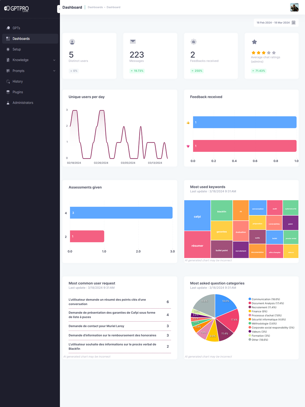
The GPT Pro Dashboard is designed to give you a quick snapshot of key metrics and activities associated with your GPT Pro instance. Here's what you'll find:
# Distinct Users
This card displays the number of unique users that have interacted with your GPT Pro instance.
# Messages
Here, you can see the total number of messages processed by GPT Pro.
# Feedbacks Received
This section shows the amount of feedbacks your system has received. Feedback corresponds to a Teams reaction (emoji) to a message.
TIP
Regularly check the feedback section to understand user satisfaction and areas of improvement.
# Average Chat Ratings
The star rating system is designed for the administrators to evaluate the quality of a conversation between the user and GPT Pro's responses.
# Unique Users per Day
The line graph illustrates the daily fluctuation of distinct users. Use this to identify trends or patterns in user engagement.
# Feedback Received Bar Chart
The bar chart provides a visual comparison between different types of feedback, such as 'heart' and 'like'.
WARNING
A higher number of negative feedbacks compared to positive ones might indicate user experience issues that need to be addressed promptly.
# Assessments Given
The "Assessments Given" section on GPT Pro quantifies and presents the total number of user evaluations provided for the service, broken down into distinct categories for comprehensive feedback analysis and quality control.
# Most Used Keywords
The treemap chart dynamically tracks and visualizes the frequency of keyword usage in queries, assisting users in identifying trending topics and areas of high interest for better insights into user engagement.
# Most Common User Request
This section provides a ranked list of the most frequent inquiries made by users, with a count next to each for easy tracking of common concerns and topics.
# Most asked question categories
The pie chart offers a colorful breakdown of user queries, enabling prioritization and trend-spotting in employee's concerns.
# Navigating the Dashboard
# Date Range Selection
At the top of the dashboard, you'll find a date range selector. Use this to filter the data displayed for a specific timeframe.
# Interpreting the Data
The data presented in the dashboard can be used to gauge the performance and user interaction with your GPT Pro instance. For instance:
- An increase in distinct users can indicate successful user acquisition efforts.
- A steady number of messages suggests consistent user engagement.
- Feedback trends can reflect user satisfaction and can guide further development.
- Most Asked Question Categories can be insightful for administrators looking to understand the areas where employees seek more information or encounter issues frequently
# Conclusion
The GPT Pro Dashboard is a powerful tool for monitoring the performance and user engagement of your GPT Pro instance. Use the insights gained here to make informed decisions to enhance your service.
Remember, the dashboard is an overview tool. For detailed analytics and user behavior, consider check the conversation history.