
# AI desk Pro Analytics Dashboard
The Analytics dashboard is the only place that looks across your whole subscription at once, covering every agent you have, combined or filtered down to just the ones you pick. Unlike General Statistics, which you open from inside a single agent, Analytics compares performance across time periods and across agents: Are users coming back more? Are they happier than last month? Is one agent carrying most of the volume?
Quick navigation
Access this from the top-level Admin Center > Analytics entry in the sidebar, next to the other subscription-wide entries (Subscription administrators and Subscription management). It only appears when you're not already inside a specific agent, and only to subscription administrators, since it's a subscription-wide view rather than a per-agent one. The entry is marked Preview.
# What you see
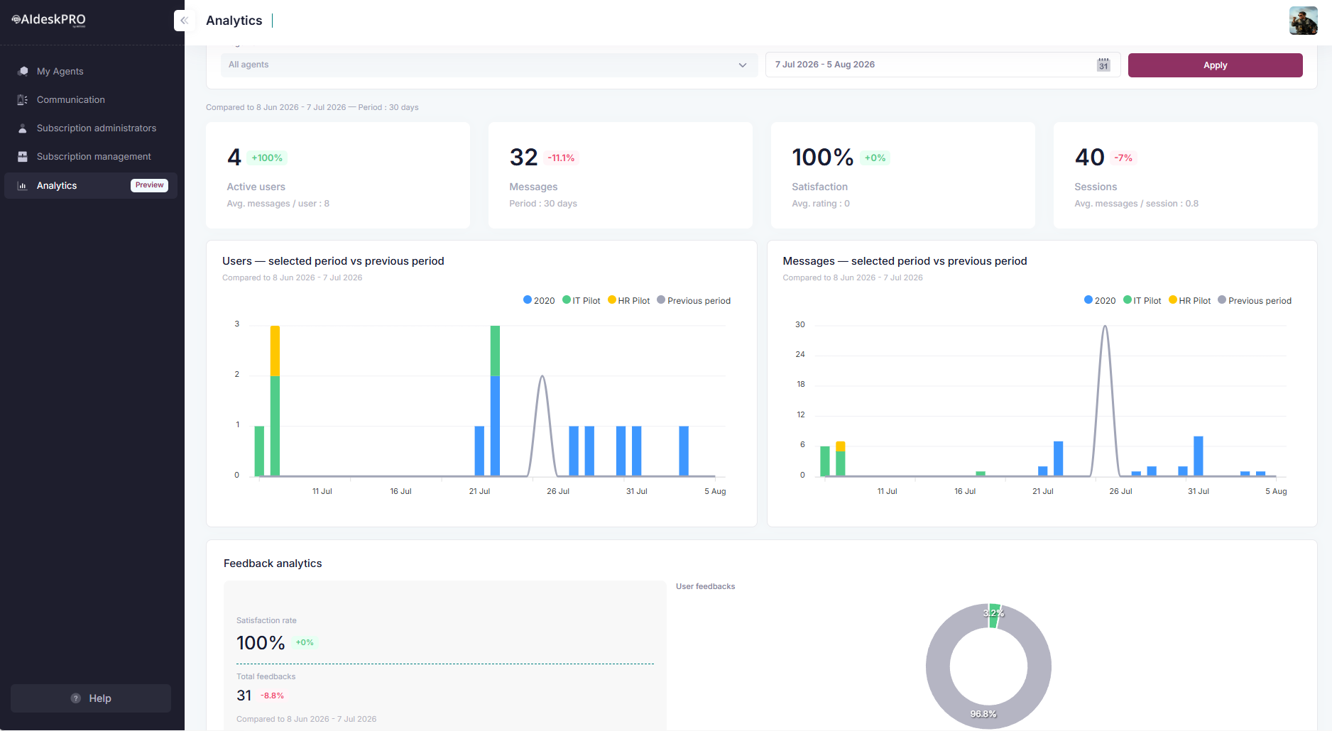
Every figure on the page, without exception, covers the period you selected and is compared to the period immediately before it, of the same length. A line just under the filter bar spells out that comparison window and the length of your selection, for example "Compared to 6 Jun 2026 - 5 Jul 2026 - Period: 30 days", so you never have to work out which dates the percentages are measured against.
# KPI cards at the top
Four tiles, each with a percentage badge comparing it to the previous period, and a smaller secondary metric underneath:
| Tile | Main figure | Secondary metric underneath |
|---|---|---|
| Active users | Distinct people who talked to the selected agents | Avg. messages / user |
| Messages | Total user messages sent over the period | Period, in days |
| Satisfaction | Satisfaction rate as a percentage | Avg. rating left by users |
| Sessions | Conversation sessions consumed | Avg. messages / session |
How to read it: A green + is good (more engagement, higher satisfaction). A red - means things got worse. Every KPI is compared to the previous period of the same length, so a 30-day selection is compared to the 30 days before it, and a "Last 12 Months" selection to the 12 months before that.
Premium sessions
When some of the period's sessions ran on a premium model, the Sessions tile shows an extra blue badge such as "incl. 120 premium". That premium count is already part of the total shown, it is not added on top. Hover the badge and the app names the premium models it covers (Claude and Mistral). See AI Models and Terms for what each provider means for your data.
# Choosing the period
The date picker at the top of the page opens on Last 30 days by default (today, and the 29 days before it). It offers these presets, plus a Custom Range for anything else:
- Last 7 Days
- Last 30 Days
- This Month
- Last Month
- Last 12 Months
- Custom Range
Dates are displayed in MM/DD/YYYY format. Picking a range reloads the page immediately, keeping whatever agent filter you had applied. Last 12 Months is the widest built-in window, and the one to use for a yearly review: it charts twelve monthly points rather than 365 daily ones, so the trend stays readable.
# All agents, or just the ones you pick
At the top of the page, the AI agents filter lists every agent in your subscription. This is the control that makes Analytics different from General Statistics:
- Leave it empty (placeholder: "All agents") and every figure on the page (KPIs, charts, feedback, most-used content) is the combined total across your entire subscription.
- Select one agent and the page behaves like a single-agent report, scoped to just that one.
- Select several agents to build an ad-hoc group, for example two pilots you want to compare side by side, or every agent except a retired one.
Pick your agents, adjust the date range if needed, and click Apply. The whole page reloads scoped to your selection. There's no saved "default group": every visit starts from all agents unless you filter again.
# The two comparison charts
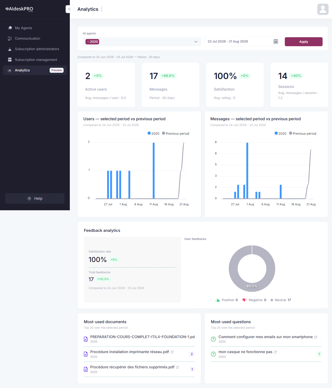
Two cards sit side by side: Users: selected period vs previous period and Messages: selected period vs previous period. Each card repeats the compared window under its title. Both charts work the same way. The selected period is drawn as stacked columns, one bucket per point in time (hour, day, or month, see below), and inside each column, one color segment per agent currently in your filter. A gray line overlaid on top traces the previous period's total, so you see both breakdowns at once: how the total is trending, and which agent is driving it.
- Filtered to one agent: the column is a single color, so this is just that agent's trend against its own previous period.
- Filtered to several agents (or "All agents" with more than one agent in your subscription): each agent gets its own color in the legend. A column that grows because one color segment grows tells a very different story than one where every segment grows evenly.
- The gray line staying above the columns means the current period is behind the previous one. Below means you're ahead.
Bucket size follows your date range automatically:
| Selected range | Bucket |
|---|---|
| Up to 24 hours | Hourly |
| Up to 62 days | Daily |
| More than 62 days (for example the "Last 12 Months" preset) | Monthly |
# Reading the axes and the tooltip
The charts are tuned to stay legible on long selections rather than to show every label:
- The vertical axis starts at zero and only steps through whole numbers, because users and messages are counts. It stops at the tallest column (the sum of every agent's segment in that bucket) or the tallest previous-period point, whichever is higher.
- Horizontal labels are thinned out past eight buckets. Only about six labels are drawn, evenly spaced, and the most recent bucket always keeps its label, since that's the one you read first. A blank tick is still a real bucket, it just isn't labeled.
- The tooltip names every bucket, labeled or not, and shows both windows at once: the current bucket and the matching previous-period bucket, separated by a slash. So a column from the previous period is never mistaken for a current date.
A caveat on the Users chart: each segment counts that agent's own distinct users for that bucket. Someone who talked to two agents in the same bucket is counted once in each segment, and someone active on several days is counted in each day's bucket. Add the segments up and you can land slightly above the deduplicated Active users KPI. The segments are there to show composition, the KPI tile is the figure to quote.
What to look for:
- Is one agent's segment shrinking while the total holds steady? Its users may be migrating to another agent, or it needs attention.
- Is messaging (segment height) growing in step with users, or are users flat while messages climb? The latter means fewer people are having deeper conversations. Not necessarily bad, but worth knowing which it is.
# Feedback analytics section
Scoped to whichever agents you've selected above, just like the rest of the page.
# Satisfaction rate and total feedbacks
Both are shown with their own variation badge against the previous period.
The satisfaction rate uses the same formula as everywhere else in AI desk Pro: positive and neutral feedback counted together, over the total number of feedbacks including negative ones. Only an explicit thumbs down pulls the rate down. The Satisfaction Rate section of the AI desk Pro Dashboard Guide gives the full formula.
A period with no complaints reads 100%
Because unrated answers count as neutral, and neutral counts as satisfied, a period where nobody clicked a thumb at all reads 100%, not 0%. Always read the rate next to Total feedbacks. A period with no feedback at all is the one case that reads 0%.
Example: "100% satisfaction rate" with "31 total feedbacks" means all 31 pieces of feedback were thumbs-up or neutral, with zero thumbs-down.
When to worry:
- Satisfaction is 100% but feedback count is low (5 total feedbacks, say). Not enough data yet to be confident.
- Satisfaction dropping while feedback count rises. Users are rating you worse and engaging more, so something broke.
- Satisfaction high but fewer feedbacks. Users aren't rating your answers; they might not care about quality.
# User feedbacks donut
Breaks the same feedback down into Positive (green), Negative (red), and Neutral (gray, feedback nobody explicitly rated), with the raw count for each under the chart.
Example: An 80/10/10 split means 80% positive, 10% negative, 10% neutral. Near-100% positive with almost no neutral is the strongest signal, because it means people are actively rating rather than just leaving the default.
# Most-used documents and questions
Below the charts, two ranked lists, Most-used documents and Most-used questions, show the top 20 over the selected period, most-cited first, each with a count badge on the right. Documents carry a blue document icon, questions a green question-mark icon, so you can tell the two lists apart at a glance.
Because this page can span several agents, each entry names the agent it belongs to right under its title, so a document or question cited from two different agents shows up as two separate rows. If the agent that owned a cited source has since been deleted, the row is labeled "Deleted agent" instead of a name.
Every openable title is a link, marked with a small external-link arrow, and opens the source in a new tab:
| Source | What opens |
|---|---|
| SharePoint file | The file's SharePoint address, in read mode |
| Local document | An Office Online preview of the file |
| Question | The question in the Knowledge Base editor |
A few rows have no arrow and no link: their stored citation doesn't point at anything that can be opened. They still count toward the ranking.
Why it matters: when you're comparing several agents, this is the fastest way to see whether they're answering from shared content or from completely separate knowledge bases, and which single piece of content is doing the most work across your whole subscription.
# How to use this dashboard
# Week-to-week tracking
Check this if you just launched something or made a major change. Did engagement spike? Did satisfaction drop?
Example workflow:
- Launch a new knowledge base section on Wednesday
- Check Analytics on Friday: Did message volume increase? Satisfaction stable?
- Check again next Monday: Is the spike holding or was it one-day traffic?
# Comparing pilots or agents
If you're running multiple agents (for example, one pilot per department) and want to see them side by side:
- Open the AI agents filter and select the specific agents you want to compare. Leave it empty first if you want to see the combined baseline across everyone.
- Set the time period ("Last 30 days", for example) and click Apply.
- Read the stacked columns: each selected agent gets its own color segment in the Users and Messages charts, and the tallest, most consistent segment is your best performer.
- Narrow the filter to just the two or three you're comparing if the legend gets crowded. Reapplying with fewer agents makes each one's segment easier to read.
- Pick the winner: expand that agent's promotion or content strategy first, then apply the lessons to the others.
# Identifying feedback trends
If overall satisfaction dropped:
- Check when it happened: Use the date range filter to narrow down the drop
- Check what changed: Did you update a question? Roll out a new agent feature? Policy change?
- Fix it: Update the content that broke, then watch Analytics next period to see if satisfaction recovers
# Running a yearly review
- Leave the agent filter on All agents and pick the Last 12 Months preset.
- Read the monthly columns: which months carried the volume, and which agents were behind them.
- Switch the filter to each agent that owns a large segment, one at a time, to get its own year in isolation.
- Use Most-used documents and Most-used questions over the same 12 months to find the content worth keeping current, and the content nobody ever cited.
# Real-world example
Scenario: Like in the screenshot above, your subscription has three agents ("2020", "IT Pilot" and "HR Pilot") and you leave the AI agents filter on All agents. The KPI tiles show the combined total for the last 30 days: 4 active users, 32 messages, 100% satisfaction. The Users and Messages charts break that same total into one color segment per agent, and most of the activity actually landed in a single spike a few weeks back, driven mostly by IT Pilot and HR Pilot together. The combined KPI tiles alone don't tell you that.
What this tells you:
- The subscription-wide numbers look healthy, but the activity isn't spread evenly across agents or across the period. It's concentrated in a short burst.
- Without filtering, you can't tell whether "2020" is even being used, or whether it's IT Pilot and HR Pilot doing all the work.
- 100% satisfaction on a handful of feedbacks means "nobody complained", not "everybody was delighted".
Your next move:
- Re-filter Analytics to just "2020" to check whether it has any activity of its own, isolated from the two pilots.
- Re-filter to IT Pilot and HR Pilot together to compare their segments directly and see which one drove the spike.
- Once you know which agent and which week, cross-check its own General Statistics dashboard for the detail Analytics doesn't show (categories, most asked subjects, action plans).
# Tips
- Compare against yesterday's data, not last month's. One day tells you if something broke. One month tells you if your strategy works.
- Link satisfaction to feedback. If 30 people rated the bot and 100% gave thumbs-up, that's strong. If 2 people rated it, that's noise.
- Watch message volume, not just user count. 100 new users sending 1 message each is signup spam. 100 new users sending 5 messages each is real adoption.
- Read the compared-to line before the badges. It names the exact window every percentage on the page is measured against.
- Archive your Analytics snapshots. Take a screenshot monthly so you have a record. The dashboard doesn't keep history forever.