
# AI desk Pro General Statistics Dashboard (Preview)
The General Statistics (preview) dashboard shows you the real picture of your agent's adoption and performance. It's where you track whether your investment in the bot is paying off, whether users are happy with it, and what to focus on next.
Access this from Admin Center > Your Agent > Dashboards > General statistics tab (or the General statistics (preview) tab for the enhanced version).
This dashboard is in preview. The interface and metrics may evolve based on feedback.
# The four metrics that matter
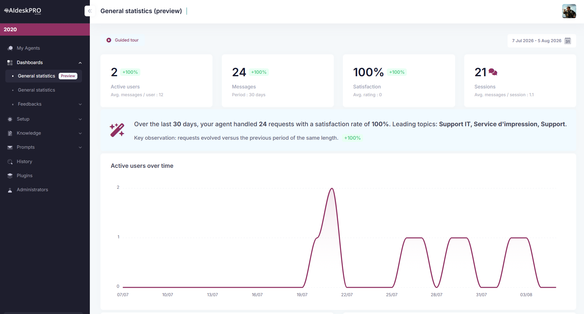
# Active users: is anyone using this?
What you see: The number of distinct users who have talked to your agent during the selected time period.
Why it matters: This is your adoption number. It tells you what percentage of your organization actually knows the agent exists and is willing to use it.
Two things to know before you compare with an older number:
- The count now follows real activity, not the date a chat was opened. A user used to be attributed to the period in which their chat session was first created, rather than the period in which they were actually active. That undercounted active users, most visibly for Microsoft Teams one-to-one sessions, which stay open for months: someone who talked to the agent every day dropped off the tile after the month they started. The figure is now computed from the messages users actually sent during the selected period, which is the definition above and the one the Active users over time chart already used, so the tile and the chart agree. A period you looked at before this fix can legitimately report a much higher number now, and the new number is the accurate one.
- The monthly Excel export matches the dashboard. The export used to stop one day short of the end of the month, so the last day was silently missing from every workbook, and its users sheet only described conversations opened during the month, which left out the users of long-lived Teams one-to-one sessions. Both are fixed. The export run now recomputes the dashboard figures over the exact window it covered and compares them with what the sheet holds, and it stops rather than deliver a workbook that disagrees.
What to watch for:
- Going up month-over-month? Your marketing is working. Keep the momentum going.
- Flat? Adoption has stalled. Time to promote it again or ask why people stopped using it.
- Going down? Something broke, or users switched to something else. Investigate.
Real example: You have 5,000 employees. In month 1, 200 use the bot (4%). By month 3, 1,000 use it (20%). That's healthy growth. By month 6, still 1,000? That's a plateau, and you need a re-engagement push.
# Messages: are they actually asking questions?
What you see: Total number of messages users sent to your agent, plus the average per user.
Why it matters: Users sending more messages means they trust the bot, they're having conversations, not just one-off questions.
What to watch for:
- High messages per user (10+): Users are having real conversations with your bot. They're exploring, asking follow-ups, really engaging. This is excellent.
- Low messages per user (2-3): Users ask one question, get an answer, leave. This works for a quick FAQ but suggests they don't see the bot as a trusted helper yet.
- Messages per user dropping: Users are asking fewer questions lately. Maybe your recent knowledge base update broke something, or they found an alternative.
Real example: You have 100 users sending 800 messages total = 8 messages/user on average. That's healthy engagement. If it drops to 4 messages/user next month, something changed. Check your recent FAQ updates or agent configuration.
# Satisfaction: are users happy?
What you see: Percentage of feedback that was positive or neutral (vs. negative). Plus an average rating if users rate answers (for example, 4 out of 5 stars).
Why it matters: A bot that nobody uses is bad. A bot that everybody uses but hates is worse. This tells you the quality of your answers.
What to watch for:
- 80%+ satisfaction: You're in good shape. Keep your knowledge base current.
- 60-80%: Room for improvement. Review the negative feedback (see Chat History) and fix common issues.
- Below 60%: Your bot is frustrating users. Something is seriously wrong with answer quality or knowledge base coverage.
Red flags:
- Satisfaction dropping sharply: A recent knowledge base update went wrong, or a bot feature broke.
- Satisfaction high but users declining: The bot works, but people stopped using it for other reasons (found something better, got lazy).
# Sessions: understanding your billing
What you see: The billed session credits your agent consumed, for the period currently selected at the top of the dashboard. Under the figure, Avg. messages / session divides the period's messages by that same total.
Why it matters: Sessions are what you are billed on. Reading them on the same period as the rest of the dashboard is what lets you connect a jump in usage to the adoption push that caused it.
Two things to know before you compare numbers:
- The total includes premium-model sessions. If your agent runs on a premium model from the Multi-model add-on (Claude, Mistral), those sessions are counted in the headline figure, and a small incl. N premium badge next to it tells you how many. The badge only appears when there is premium usage, so agents that never used the add-on look exactly as before. Previously the tile reported the standard pool only, which under-reported any agent used mainly or exclusively through a premium model.
- The figure follows your selected period, not a fixed month. Change the date range and the number changes with it, because it is recomputed over the exact range you picked instead of summing whole calendar months. Two consequences: a number you read today will not match an older screenshot taken with a different range, and the tile now works for partial periods and for periods older than the aggregation job.
The tile and the Subscription Management page use the same formula, so they agree whenever your selected period covers the whole month. On a partial period the tile can land a credit or two above a strict share of the monthly total, because credits are rounded per bucket. For your plan's quota and how much of it is left, use Subscription Management, which is the page that tracks the entitlement.
Example: You select "Last 30 days" mid-month and read 62 sessions, 18 of them premium. Switch the range to the current calendar month and the figure drops, since you are now asking about fewer days. Neither number is wrong: check which period is selected before you compare.
The first time you open the preview dashboard (or any time you want a refresher), click Guided tour at the top of the page. It walks you through every section below, one at a time, explaining what it shows and how to read it.
# Active users over time
What you see: A line chart of distinct daily users across the selected period, right below the period summary banner.
Why it matters: The four KPI tiles give you the period total, but this chart shows the shape of it. A steady climb means adoption is spreading organically. A spike right after a launch or a promotion campaign, followed by a drop, tells you the initial push faded and it's time to re-engage rather than assume the agent lost relevance.
# Conversation categories
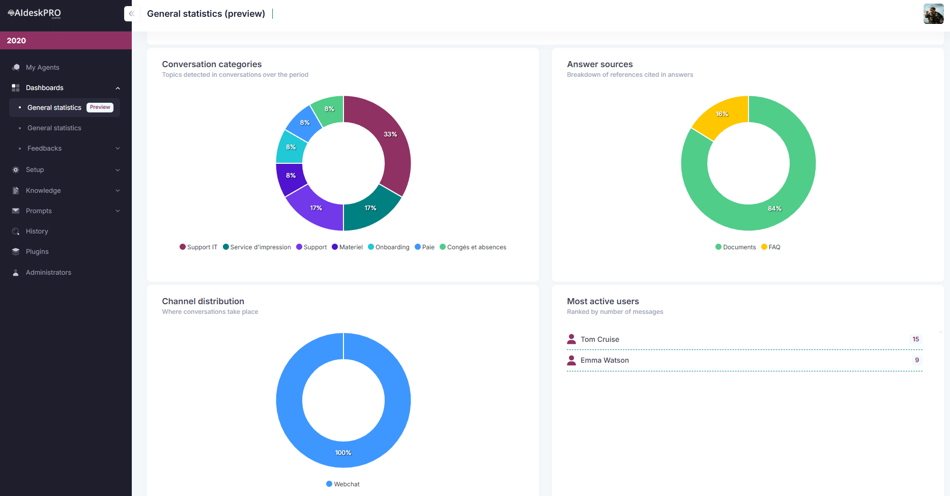
What you see: A donut chart titled Conversation categories, showing the topics automatically detected in conversations over the period, as a share of the whole.
How it works behind the scenes: Every 15 minutes, a background job picks up the bot's recent user messages in small batches and asks an AI model to categorize each one, reusing the categories and keywords already seen for that bot so labels stay consistent over time instead of drifting with every run. Small talk ("Hi", "Thanks") is filtered out automatically and never counts toward a category.
Off-topic questions no longer pollute the chart. Questions that fall outside what a company assistant is there for (sport, weather, celebrities, general trivia, or filler sent to test the agent such as "test test" or "message 42") now get their own dedicated OUT_OF_SCOPE label instead of being swept into a vague catch-all bucket, and that label is excluded from the donut and from Most asked subjects, just like small talk. Practical effect: your top slice is a real business subject again, not a mixed bag. Labels that only name the act of asking, in any language or spelling ("General Inquiry", "Demande d'informations", "Divers"), are also kept out of the chart, because they describe the request rather than its subject.
Category assignment is now stable between runs. The same period used to come back with visibly different categories from one computation to the next, and a single recurring question could land under two or three labels. Three things changed:
- The categorization model runs with creativity turned off, so a given question gets the same label every time instead of following whatever else was in its batch.
- Each distinct question is consolidated to one winning category and all of its occurrences are reported there, and near-identical labels are folded together, so a singular and a plural spelling of the same subject no longer split one subject into two slices.
- The earlier bias that pulled loosely related questions into whichever category was already the largest is gone. Expect a more honest spread across categories than before, and a top slice that is smaller but real.
Because these are computation changes and not display changes, a period you looked at before the fix can legitimately show a different breakdown now. The new breakdown is the accurate one.
The donut's color palette also had two duplicated colors, which made distinct categories look like the same slice. The palette is now all-distinct, so one color means one category.
Why it matters: The biggest slices are where demand concentrates. That's where your content and answer-quality efforts pay off first. A small category with a bad answer barely dents satisfaction; a large one with a bad answer tanks it.
Next to it, a second donut, Answer sources, breaks down what backed the agent's answers over the same period: FAQ, documents, or web search. A category that leans heavily on web search is usually a category where your own knowledge base is thin.
# Most asked subjects: click to drill in
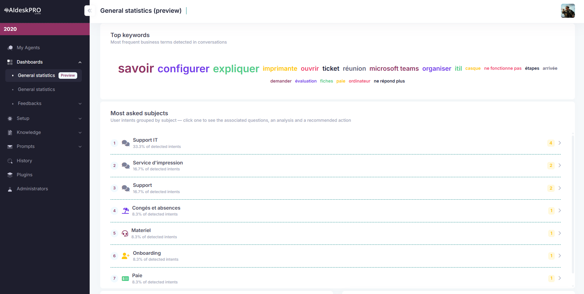
Below the category chart, Most asked subjects groups similar user intents together (every phrasing of "how do I request time off," for instance, collapses into one subject) and ranks them by volume. This is a different, more actionable cut than the Categories donut above it: categories are the raw AI-assigned labels, while subjects are grouped into recognizable business themes (Leave & time off, Payroll & compensation, Expenses & travel, Training & skills, Benefits & perks, Security & compliance, IT support, HR & onboarding, Policies & procedures, or General when a subject doesn't fit any of these).
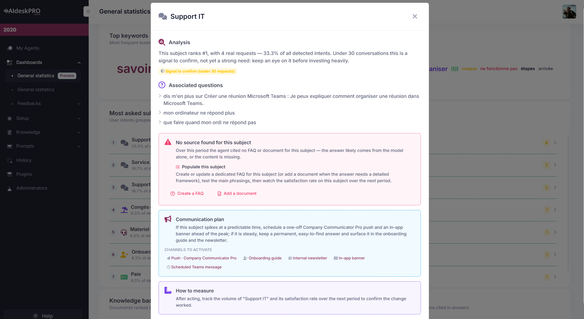
Click any subject to open a dialog with:
| Section | What it shows |
|---|---|
| Analysis | The subject's rank, volume, and % share of all detected intents, plus an honest confidence read: 30+ grouped requests earn a green Confirmed signal badge; under 30 gets an amber Signal to confirm badge, so you don't overinvest in noise. |
| Associated questions | Up to 12 of the real, verbatim user questions grouped under this subject. |
| Associated references (estimate) | The specific FAQ entries and documents the agent actually cited while answering this subject (up to 6, most-cited first), each a clickable link that opens the source directly so you can verify it's accurate and current. If nothing was cited, this becomes a warning instead, "No source found for this subject", with one-click buttons to Create a FAQ or Add a document. |
| Expert tip | Advice tailored to the subject's theme. For example, IT support subjects get a tip about numbered troubleshooting steps and a ticket escalation path; Payroll subjects get a reminder to never expose individual figures and redirect personal cases to the payslip portal. |
| Communication plan | A concrete, theme-specific outreach idea (for example: "two weeks before the seasonal peak, push a targeted notification via Company Communicator Pro") plus the channels typically used: a Company Communicator Pro push, the onboarding guide, the internal newsletter, an in-app banner, or a scheduled Teams message. |
| How to measure | A reminder to check this subject's volume and satisfaction rate again next period, to confirm whatever you changed actually worked. |
# Most used documents and FAQ
What you see: Two ranked lists side by side, Knowledge base documents and Knowledge base questions, each listing your content ordered by how many times it was actually cited in an answer during the period, most-cited first (capped at the top 20 items). Every title is a clickable link that opens straight to that document or FAQ in a new tab, so you can review or update it on the spot.
Why it matters:
- Items sitting at zero are configured but were never cited, so they are candidates to rewrite, promote, or retire.
- Items at the top are carrying the most weight in your agent's answers, so keep them accurate, since an error there affects the most conversations.
# Recommended action plans (your adoption plan)
What you see: A bank of recommendation cards under Recommended action plans, each with an impact badge, an effort badge, a description, concrete steps, a suggested owner, an expected outcome, and a button that deep-links straight to the relevant admin page (Welcome Cards, Documents, Instructions, Chat History, or Feedbacks).
There are five possible plans. They're not static. Each one is prioritized dynamically from your real telemetry, so the most relevant recommendation floats to the top:
| Plan | Floats to the top (High impact) when... | Suggested owner | Its button opens |
|---|---|---|---|
| Drive adoption | Average messages per active user is under 3, so engagement is shallow | Adoption lead | Customize the welcome → Welcome Cards |
| Close content gaps | Your documents + FAQ combined total fewer than 10 items | Content team | Enrich the knowledge base → Documents |
| Improve answer quality | Satisfaction rate is below 80% | Product team | Tune the answers → Instructions |
| Recruit champions | You have at least one active top user to turn into an ambassador | Internal communication | Analyze conversations → Chat History |
| Measure & steer adoption | Always shown, as a baseline, to turn the dashboard into a monthly ritual | Adoption lead | View detailed statistics → Feedbacks |
The shortcut into the Feedbacks page used to sit on the Improve answer quality plan. It now belongs to Measure & steer adoption, which is the plan about turning the dashboard into a recurring review, and Improve answer quality sends you to Instructions instead, where you actually change how the agent answers. If you had bookmarked the old path, start from the measure plan.
When a plan is triggered by your real data, a blue "Why now" banner explains exactly which number drove it (for example, "Why now: satisfaction is at 62%, below the 80% bar"). Those banners previously printed a raw {0} placeholder instead of the figure on some plans; they now show the real number, so the banner is safe to quote in a review. The impact/effort levels and the recommended steps themselves are fixed adoption best practices. What's dynamic is which plans get prioritized and why.
# The rest of the dashboard at a glance
A few more sections round out the preview dashboard:
- Channel distribution: A donut showing where conversations happen, Microsoft Teams or Webchat. Useful to confirm where to focus your promotion efforts.
- Most active users: A ranked list of the users who sent the most messages over the period (grouped as "Anonymous users" when no name is available). Your best candidates for the "Recruit champions" action plan above.
- Top keywords: A word cloud of the most frequent business terms detected in conversations, sized by frequency. A quick way to check you're phrasing your FAQ the way users actually ask.
- Ratings by score: A bar chart of the distribution of ratings users explicitly left on answers, complementing the Satisfaction KPI with the raw spread. A cluster of low scores points to answers worth reviewing first.
# Practical workflows
# Monthly review (15 minutes)
- Set the date range to "Last 30 days"
- Check adoption: Are active users growing, flat, or declining?
- If growing: excellent, document it for your leadership
- If flat: plan a promotion for next month
- Check engagement: Is messages/user healthy or dropping?
- Healthy: continue what you're doing
- Dropping: audit your recent knowledge base changes
- Check satisfaction: Is it 75%+?
- Yes: celebrate the quality
- No: review negative feedback in Chat History
- Scan Most asked subjects and Recommended action plans: Any subject with no associated references? Any action plan with a "Why now" banner? Pick one to act on before next month.
- Note for next month: Did anything surprising happen?
# Quarterly review (30 minutes)
- Look at the last 90 days to see seasonal patterns
- Compare to 3 months ago:
- How much did active users grow?
- How has satisfaction trended?
- Are messages/user improving or declining?
- Decide on actions:
- Do you need to upgrade your plan (hit session limits)?
- Should you invest more in knowledge base?
- Is it time to promote the agent to new departments?
# Common scenarios and what they mean
| Scenario | What it means | What to do |
|---|---|---|
| Users growing, satisfaction stable | Adoption working, quality holding | Keep promoting, maintain KB |
| Users flat, satisfaction dropping | Something broke or bot got worse | Review recent changes, check feedback |
| Users declining, satisfaction high | Bot is good but people stopped using it | Investigate why (new tool? policy change?) and re-promote |
| Users growing, satisfaction dropping | New users are unhappy or KB is broken | New users need onboarding; check recent KB changes |
| Messages/user very high | Users really trust the bot, having real conversations | Excellent signal. Make sure you can handle the load |
| Messages/user dropping while users grow | New users are less engaged than early adopters | Normal pattern; keep promoting to build critical mass |
# Tips for success
- Set a calendar reminder to check this dashboard on the same day each month. You'll spot trends instantly.
- Compare against your launch date. A new agent should expect: Month 1: 10-20% adoption, Month 3: 30-50%, Month 6: 50%+. If you're ahead, good. Behind? Time to market harder.
- Share with leadership. "500 users, 82% satisfaction, up 15% from last month" is a compelling story for budget allocation.
- Link satisfaction to knowledge base. If satisfaction drops, don't assume the agent broke. Check if someone updated a FAQ incorrectly.
- Watch for seasonal dips. Summer slump? Holiday break? Expected. Just don't mistake it for declining interest.